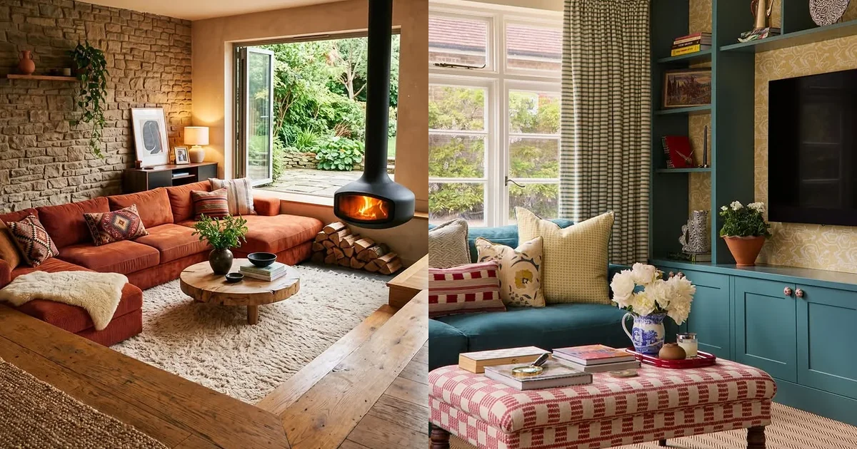
18 Living Room Color Schemes That Feel Fresh and Modern
Painting the walls is the fastest way to change how a living room feels, but picking from all the living room color schemes out there can feel harder than the painting itself. This list narrows it down to eighteen pairings that work in real rooms, from warm earthy neutrals to bold jewel tones.
Every idea below comes with a real photo and a simple breakdown, so you can see how the colors play together before you commit to a single can of paint.
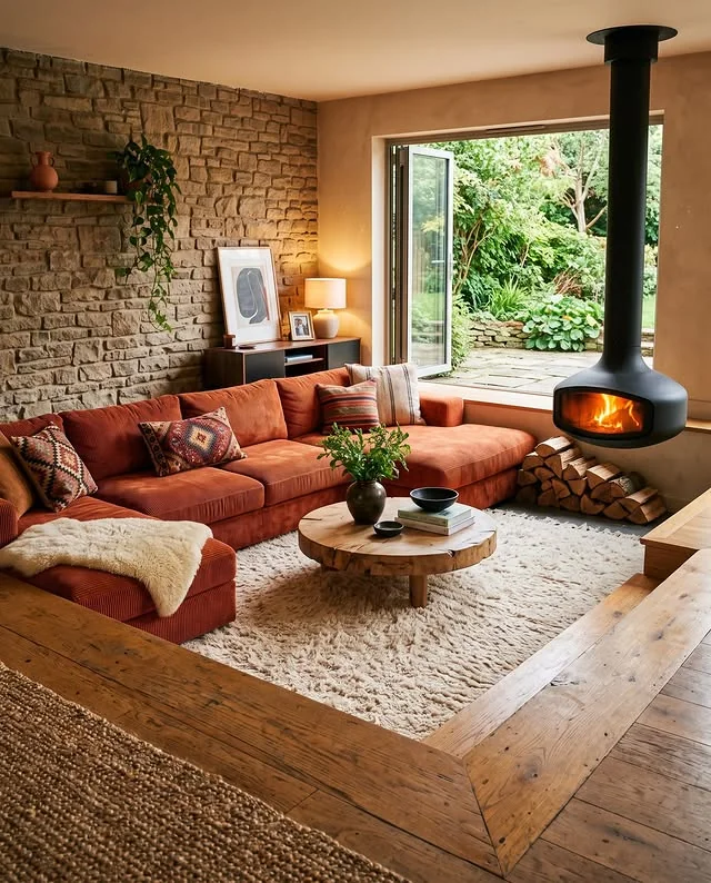
Warm Cream and Terracotta
Terracotta brings instant warmth, and a soft cream keeps it from feeling heavy. The pair works best when the terracotta sits on the big pieces, like a sofa or an accent wall, while cream covers the rest.
- Terracotta sofa or armchairs as the anchor
- Cream walls, rug, and curtains to balance the heat
- Natural wood and stone for an earthy finish
Sage and Beige
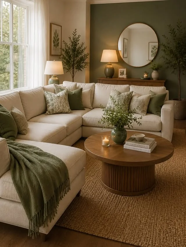
Sage green reads calm and grown up, and beige keeps it soft rather than cold. Use sage on upholstery or an accent wall, then layer beige in linen, jute, and light wood.
- Start with a beige base on walls and the largest rug
- Add sage in the sofa, curtains, or one painted wall
- Finish with plants and warm wood to pull it together
Charcoal and Mustard
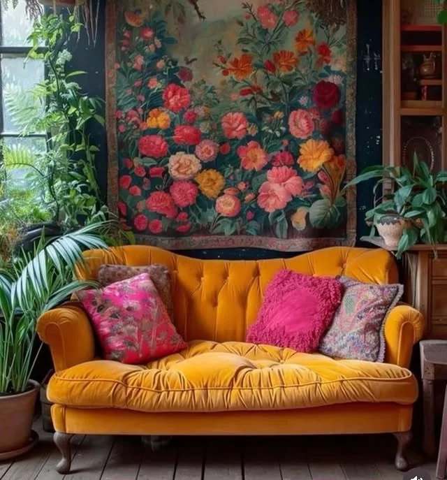
Charcoal gives a room depth and drama, while mustard keeps it from going gloomy. Because both are strong, the ratio matters more than anything else.
DO: Let charcoal cover the walls or the biggest sofa, and keep mustard to pillows, one chair, or art.
DON’T: Split the room fifty-fifty between the two, or the space feels chopped in half.
Gray and Blush
Soft gray is a quiet backdrop, and blush pink adds just enough sweetness without turning the room into a nursery. Keep the gray cool and light so the blush pops gently.
Quick Tip: Choose a gray with warm undertones. Cool grays can make blush look washed out under daylight.
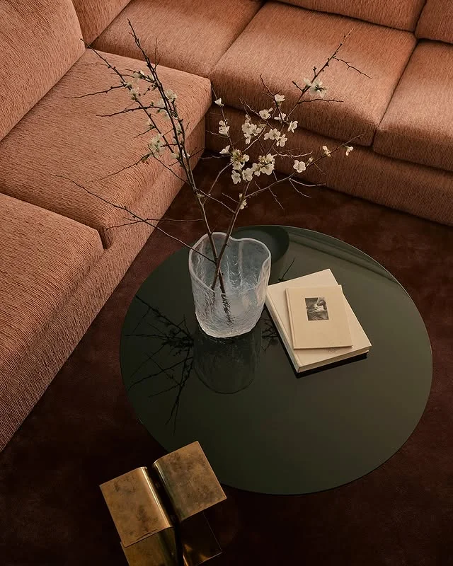
Navy and Brass
Navy shows up in some of the most loved living room color schemes for a reason. It feels tailored and rich, and brass details give it a glow that flat neutrals never manage.
Before: Beige walls, a gray sofa, and no metal accents. Pleasant, but forgettable.
After: Navy walls or a navy sofa, brass table lamps, and a mirror with a thin brass frame. Same room, ten times the character.
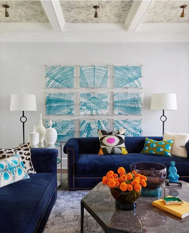
Black and White
The classic monochrome scheme never dates. The trick is texture. Without color, your eye reads the room through fabric, sheen, and shape instead.
Budget: About the cost of pillows, a rug, and one black accent piece if your base is already white.
Time: A weekend. Swap textiles, add black frames, and style once.

Olive and Rust
Olive and rust share the same autumnal root, so they always sit well together. Olive acts as the neutral and rust as the spark.
Palette:
- Olive Green: sofa or drapes
- Rust: throw pillows and a blanket
- Warm Beige: walls and rug
- Dark Wood: frames and side tables

Dusty Blue and Cream
Dusty blue is the relaxed cousin of navy. It pairs with cream for a look that feels coastal without a single seashell in sight.
- Dusty blue walls with a cream slipcovered sofa
- Cream walls with a dusty blue velvet armchair
- A blue and cream patterned rug tying both together

Forest Green and Camel
Deep forest green feels like a library, and camel leather or wool softens it into something livable. This is a great scheme for rooms that get lots of natural light.
- Forest green sofa or painted bookcases
- Camel leather chair or ottoman
- Brass and warm wood to bridge the two

Greige and Taupe
Greige sits right between gray and beige, and taupe deepens it just enough to add shape. It is the definition of a quiet luxury palette, and it photographs beautifully.
- Paint walls a warm greige and keep trim bright white
- Layer taupe in the sofa, drapes, and wool throws
- Add one dark element, like black frames, so the room has an edge
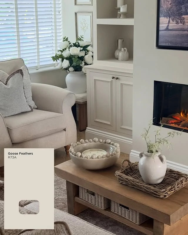
Peach and White
Peach is back in a big way, and it works best when white does the heavy lifting around it. The result is sunny but still grown up.
DO: Use peach on one wall, a sofa, or the drapes, and keep everything else crisp white.
DON’T: Pair peach with orange or coral. Similar hues muddy the scheme instead of lifting it.
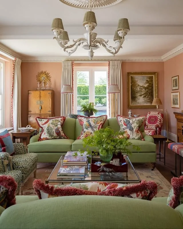
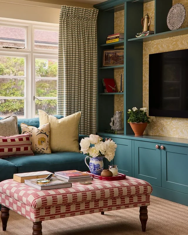
Teal and Brass
Deep teal walls make a living room feel like a boutique hotel, and brass hardware and lighting keep the mood warm instead of cold.
Quick Tip: If full teal walls feel risky, start with built in shelving or a single accent wall. You get the drama at a fraction of the commitment.
Sand and Chocolate
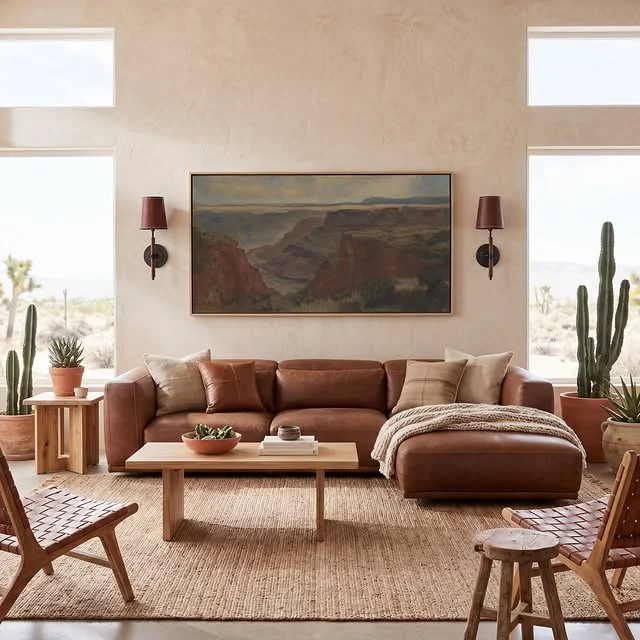
Sand and chocolate is the palette of a desert landscape, and it brings the same calm into a living room. Layer the two with plenty of texture so the browns never read flat.
Before: White walls with scattered beige furniture and no clear palette.
After: Warm sand walls, a chocolate leather sofa, woven baskets, and layered natural rugs.
Lavender and Gray
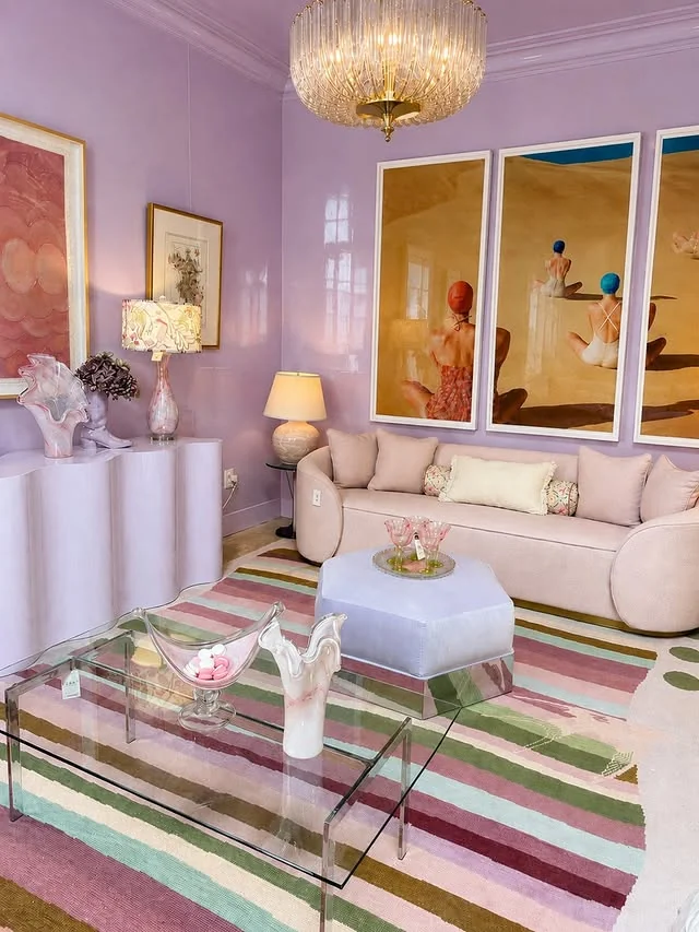
Lavender is softer than purple and more interesting than plain gray. With the right balance it reads as a true neutral with a quiet sense of color.
Budget: A can of paint for one wall plus lavender pillows and a gray throw.
Time: One weekend for the paint, an afternoon for styling.
Mediterranean Terracotta
Think sunbaked clay, limewashed walls, and dark wood. This Mediterranean take on terracotta is richer and older feeling than the modern terracotta and cream look.
Palette:
- Burnt Terracotta: walls or tile
- Warm Cream: upholstery and plaster
- Dark Walnut: beams and furniture
- Olive: plants and ceramics
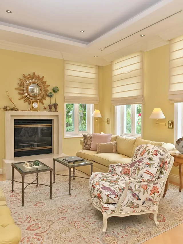
Pale Yellow and Gray
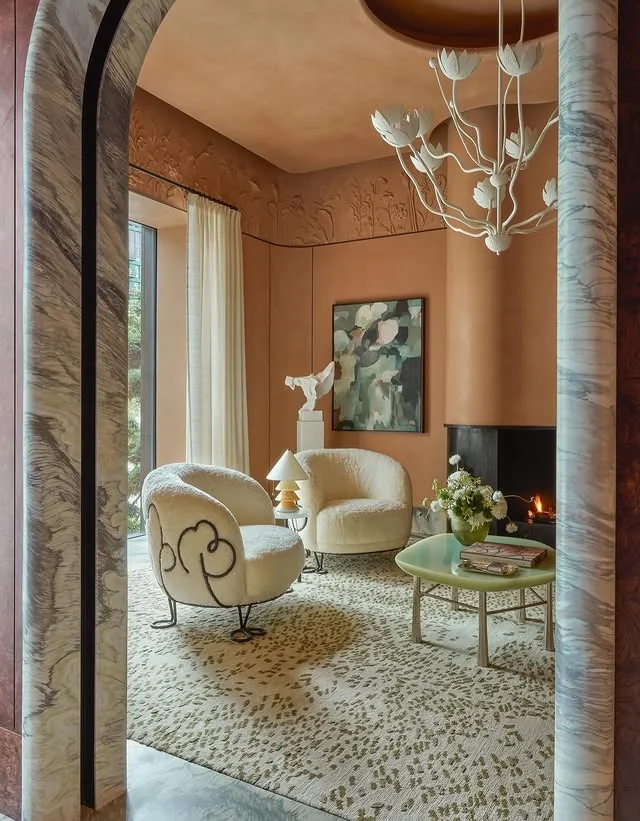
Pale yellow brings the sunshine and warm gray keeps it sophisticated. Together they suit both traditional and modern rooms.
- Pale yellow walls with a warm gray sofa
- Warm gray walls with pale yellow drapes
- A gray and yellow patterned rug as the bridge piece
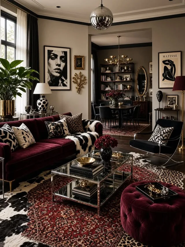
Burgundy and Ivory
Burgundy adds a richness that few other colors can match, and ivory keeps it from feeling dark. It is a natural fit for cozy evenings and formal sitting rooms alike.
- Burgundy velvet sofa or armchairs
- Ivory walls, curtains, and a light rug
- Dark wood and aged brass for depth
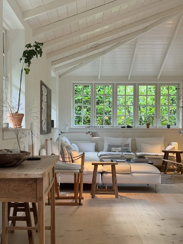
Green and White
Crisp white walls with green in plants, textiles, and one good armchair is the freshest scheme on this list. It suits small rooms because white bounces the light around.
- Keep walls and the largest pieces white
- Add green through plants, pillows, and one chair
- Ground it with light oak or rattan
Conclusion
The right palette changes everything, and these living room color schemes show how much range two or three well chosen colors can give you. Start with the mood you want, then let the pairings do the work.
Pin your favorites, sample the paint before you commit, and remember that textiles are the easiest way to test a scheme. For more inspiration, explore these related guides:



One Comment